Pantone, the leading global authority on color and color systems, is world-renowned and recognized as the go-to source for color communications from designer to manufacturer to retailer to customer. Plainly stated, what Pantone dictates in terms of color trends and application – goes – with its influences trickling into fashion, beauty, home décor, and the creative arts.
Every year, Pantone announces the color of the year, often forecasting what will traverse the runway by means of fashion, and paint the facial canvases of many enthusiasts in terms of the cosmetics industry. While last year’s color of the year, Marsala, rocked the universe – this year’s color or colors we shall say, are ones with a primitive focus on wellness, harmony, and everything in between. With the current state of the world swarming with negativity and dispute, Pantone chose the 2016 Colors of the Year for their ethereal calmness and ability to allow one to escape.
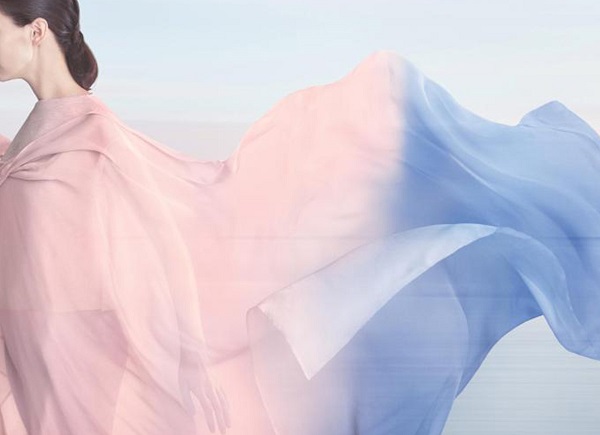
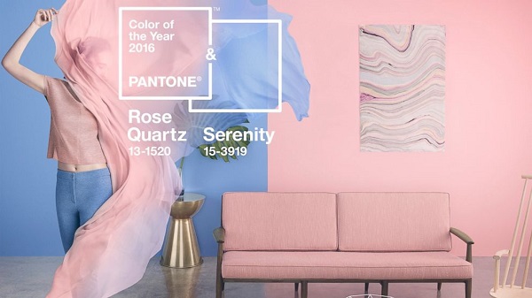
For the first time in history, Pantone chose two shades as the cornerstone of its color trends announcement. And without further ado, the 2016 Colors of the Year are…drumroll please: Rose Quartz and Serenity.
“As consumers seek mindfulness and well-being as an antidote to modern day stresses, welcoming colors that psychologically fulfill our yearning for reassurance and security are becoming more prominent,” the Pantone website comments.
A far opposite from last year’s wine-inspired earthy shade of Marsala, Rose Quartz and Serenity are a compatible harmonious pairing, embodying tranquility and inner peace.
“Joined together, Rose Quartz and Serenity demonstrate an inherent balance between a warmer embracing rose tone and the cooler tranquil blue, reflecting connection and wellness as well as a soothing sense of order and peace,” Pantone Color Institute Executive Director Leatrice Eiseman adds.
From the fashion spectrum, experts note a more androgynous approach to color. As menswear embraces more shades of pink, feminine collections will chart more movement into blues – symbolically emphasizing gender neutrality in fashion, the beauty of choice, and a revolt against gender color-coding in fashion. Designers will blend both rose quartz and serenity by creating canvas’ that can adapt towards any style, for creative and colorful expression.
“Appealing in all finishes, matte, metallic and glossy, the engaging combo joins easily with other mid-tones including greens and purples, rich browns, and all shades of yellow and pink. Add in silver or hot brights for more splash and sparkle,” Pantone advises.
In beauty, both shades exude a soft and natural statement, and flatters all skin tones effortlessly. Within the home, a mix of both Rose Quartz and Serenity will bring both calmness and relaxation the minute one opens the door, as Pantone experts note how colors influence mood and perspectives both psychologically and philosophically.
Bringing feelings of “respite and relaxation” during turbulent times, we’ll be keeping an eye out on how designers, decorators and industry professionals put their creative spin on these two shades. For more on the Pantone Institute, its color influences and the 2016 Colors of the Year, visit www.pantone.com.


